Givecloud // Case Study
Type
Product / Web / UI motion
Timeline
6 Weeks
Role
Design & Animation
Deliverables
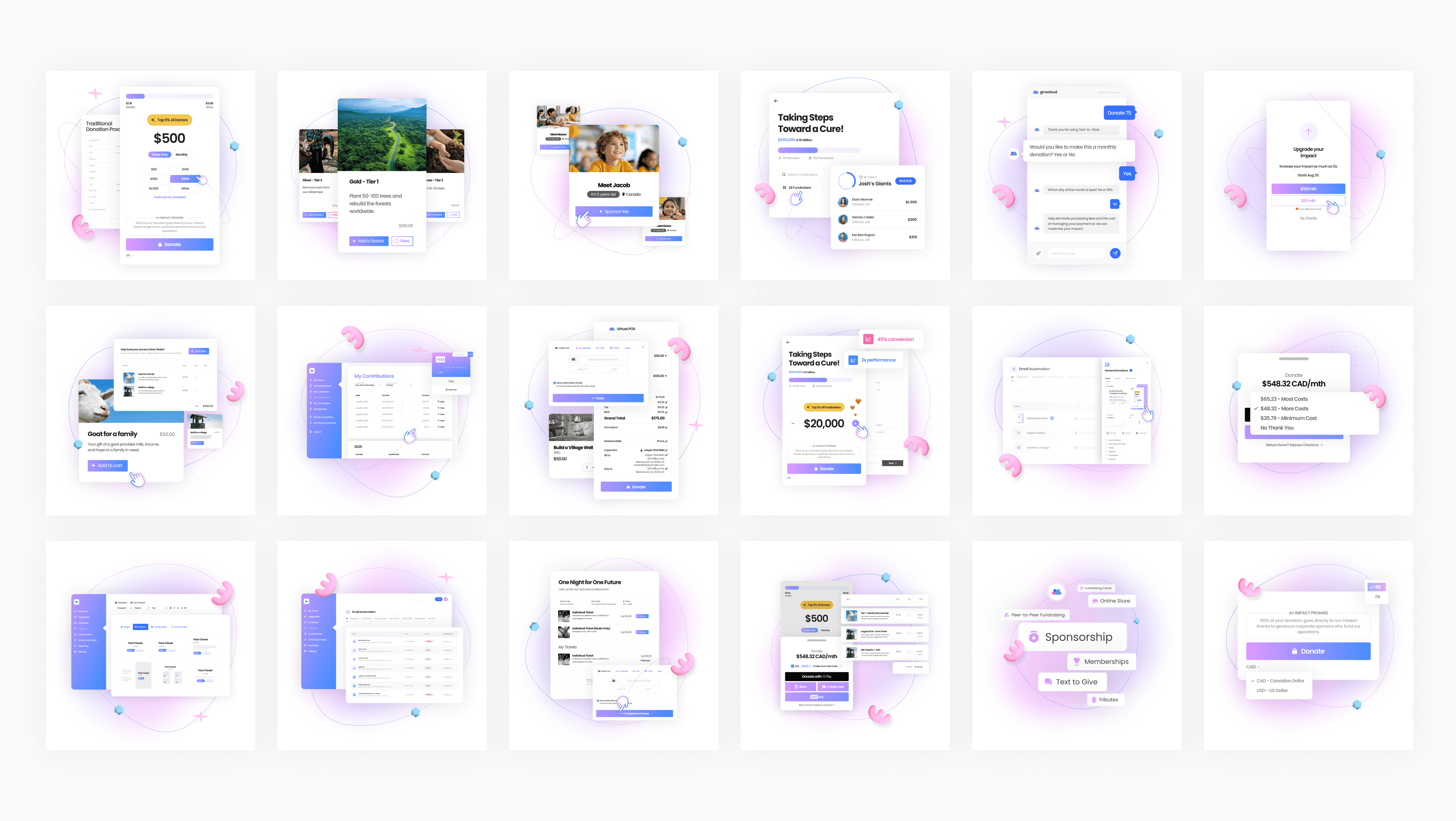
21 Lotties + 32 Static Graphics
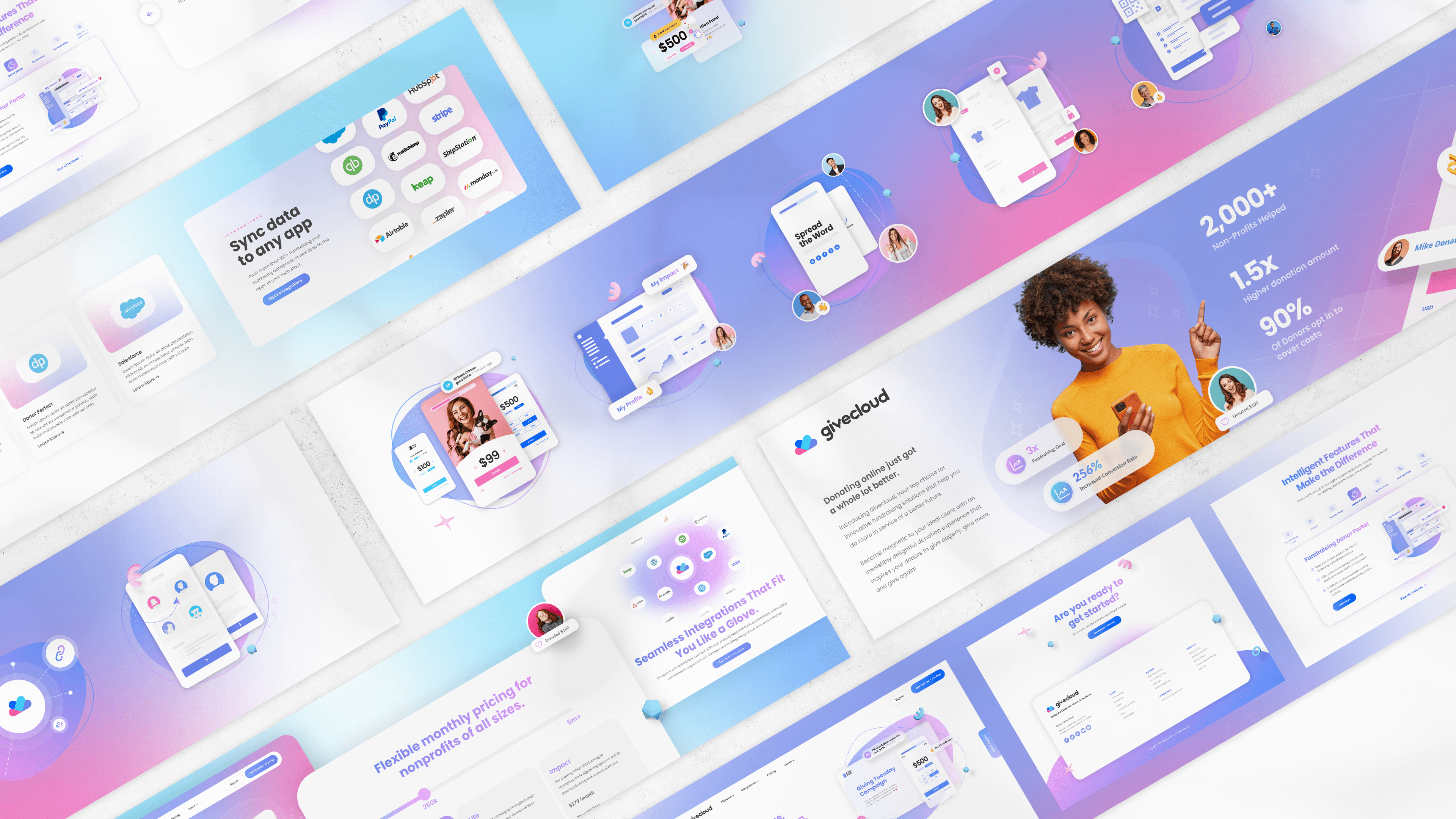
A full suite of playful, loopable product animations that clarify Givecloud’s donation features, elevate their rebrand, and make complex workflows feel simple and engaging.
Challenge
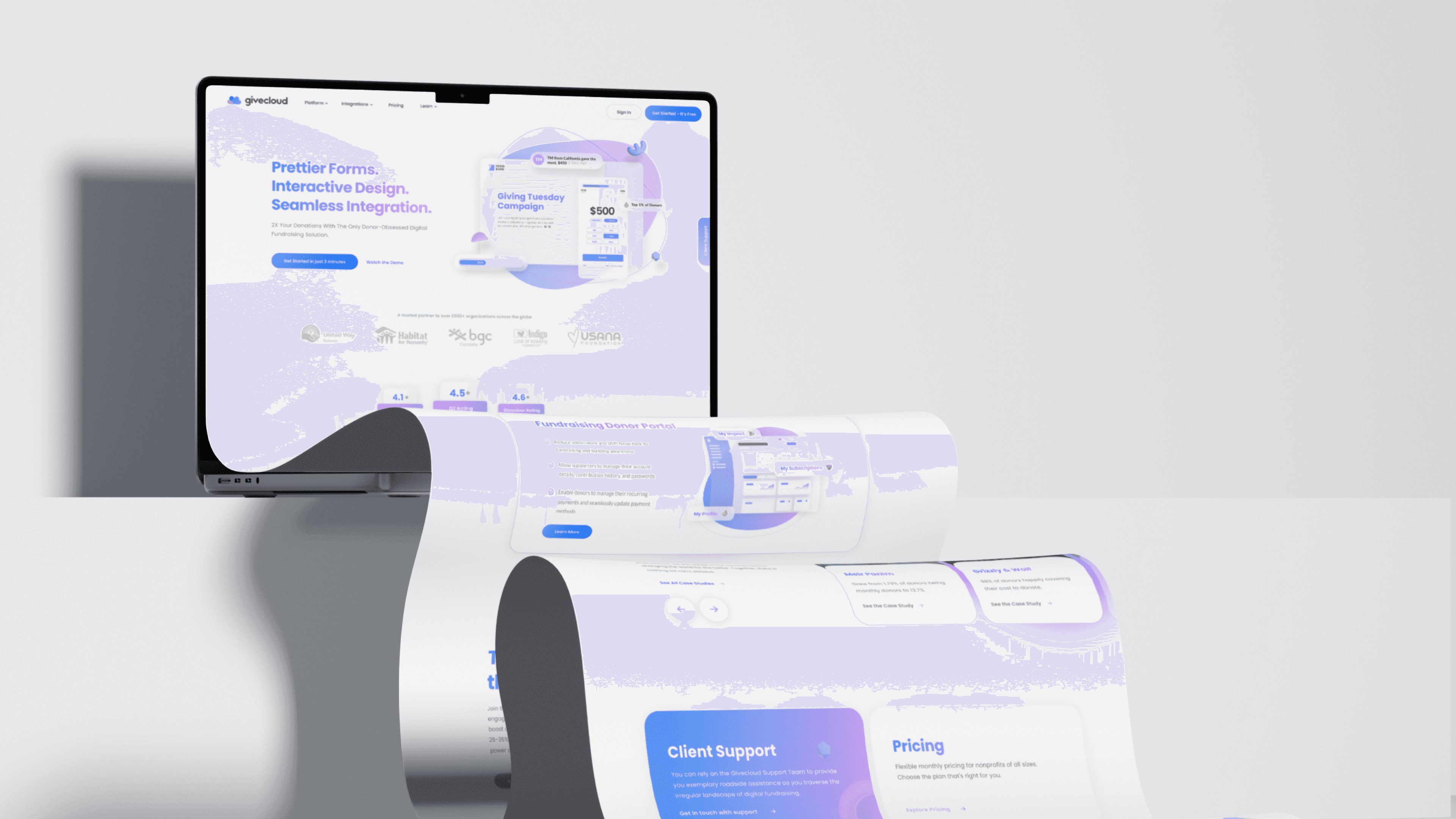
Clarifying features while elevating the website’s visual experience.
Their previous site relied heavily on long paragraphs of text, causing new users to get lost and disengage. They wanted to appear more reputable, modern, and trustworthy, and motion became a key part of that transformation.
Constraints:
Quick loading
Existing brand guidelines
Must work across all web platforms
Minimal existing product screens
Multiple aspect ratios
Web‑performance limitations
Loopable motion
Lottie compatibility


Approach
The plan of attack
Prior to design and animation, a plan needed to be devised based on a few key pieces of information.
Key decisions included:
Typography & color: Pulled directly from the brand guide
Motion: Fast energetic movements to emphasize play
Pacing: Determined by content density and average user dwell time
Interaction cues: Mouse interactions added to guide user
Structure: Built from a supplied brief describing required features and steps
Research
Review, research, and breakdown
Givecloud’s product interface, brand language, personas, and competitors were studied to ensure the animations felt like a natural extension of the platform. The personas made it clear: users often find donation workflows long and boring. Our animations needed to hold attention, reduce perceived complexity, and visually demonstrate how Givecloud shortens the process.
Research included:
Product UI and documentation
Personas (non‑technical users, community leaders, non‑profit staff)
Competitors such as Double the Donations and DonorPerfect
Experiments with abstract vs. literal UI representation
Motion patterns from similar donation platforms


Animatic & Iteration
Breaking each feature into small, digestible steps.
I broke each feature into small, digestible steps that mirrored how a user would interact with the platform. The pacing needed to feel playful yet trustworthy, with each step readable within roughly 1.5 seconds — long enough to understand, short enough to keep users engaged.
Storyboard included:
Refining interaction cues
Ensuring readability
Aligning motion with brand personality
Confirming Lottie compatibility
Technical Decisions
Stay organized, efficient, and ensure assets load on all devices.
To stay organized and efficient, all animations were built within a single master file so assets could be reused across features. Designs were reviewed and pitched based on the studied Lottie‑compatible capabilities.
Technical considerations included:
Designing for Lottie compatibility
Exporting non‑Lottie elements into a single organized folder
Building all graphics in a 1×1 square to fit a two‑column grid
Ensuring low file sizes for fast loading
Creating modular components for reuse across 32+ graphics

//
Outcome
Impact & Results
Improving website experiences
& product clairfty
The animations helped Givecloud feel modern, trustworthy, and easier to understand — exactly what the rebrand aimed to achieve.
Outcomes included:
Higher click‑through rates
Better feature adoption
Improved comprehension in user testing
Fewer support questions
Reuse of designs across multiple campaigns
Additional work generated from the success of the project
Studio
Webmarketers
Creative Direction
James Gollner
Design & Animation
Matthew Desmarais
Coordinators
James Ward
Technical Direction
Sonny Juane
Development
Roch Lavoie