Givecloud
Givecloud partnered with us to elevate their rebrand and website experience through a full suite of product animations and UI motion.
Over six weeks, I designed and animated a large collection of feature‑driven graphics built to simplify complex donation workflows and make the platform feel more modern, trustworthy, and easy to understand.
Type
Product / Web / UI motion
Timeline
6 Weeks
Role
Design & Animation
Deliverables
21 Lotties + 32 Static Graphics
//
Challenge

Givecloud’s rebrand required animations that clarified complex features and elevated their website beyond text‑heavy explanations. They needed to feel modern, trustworthy, and easier to understand.
Their donation flow is gamified, reducing steps and making the experience more engaging. The animations had to capture that feeling — playful, simplified, and accurate — while staying abstract enough to enhance the website visually.
Constraints:
Quick loading
Existing brand guidelines
Must work across all web platforms
Minimal existing product screens
Multiple aspect ratios
Web‑performance limitations
Loopable motion
Lottie compatibility
//
Approach

The design team provided a style guide that established the brand’s typography, hierarchy, color system, and imagery. This gave me a solid foundation to build animations that felt cohesive with the new identity.
I broke each feature into small, digestible steps that mirrored how a user would interact with the platform. The pacing needed to feel playful yet trustworthy, with each step readable within roughly 1.5 seconds — long enough to understand, short enough to keep users engaged.
Key decisions included:
Typography & color: Pulled directly from the brand guide
Motion: Loopable sequences with slight pauses between steps for Lottie state control
Pacing: Determined by content density and average user dwell time
Interaction cues: Mouse interactions added to guide user understanding without relying on camera movement
Structure: Built from a supplied brief describing required features and interactions
//
Research

I reviewed Givecloud’s product interface, brand language, personas, and competitors to ensure the animations felt like a natural extension of the platform. The personas made it clear: users often find donation workflows long and boring. Our animations needed to hold attention, reduce perceived complexity, and visually demonstrate how Givecloud shortens the process.
Research included:
Product UI and documentation
Personas (non‑technical users, community leaders, non‑profit staff)
Competitors such as Double the Donations and DonorPerfect
//
Animatic & Iteration

Each animation began with a rough storyboard to ensure the flow was correct. Feedback loops were tight due to the timeline, so early clarity was essential.
Iteration process:
Refining interaction cues
Ensuring readability and accuracy to the original
Aligning motion with brand personality
Confirming Lottie compatibility
//
Technical Decisions

To stay organized and efficient, all animations were built within a single master file so assets could be reused across features.
Technical considerations included:
Designing for Lottie compatibility (no unsupported effects)
Exporting non‑Lottie elements into a single organized folder for developers
Building all graphics in a 1×1 square to fit a two‑column grid
Ensuring low file sizes for fast loading
Creating modular components for reuse
//
Outcome
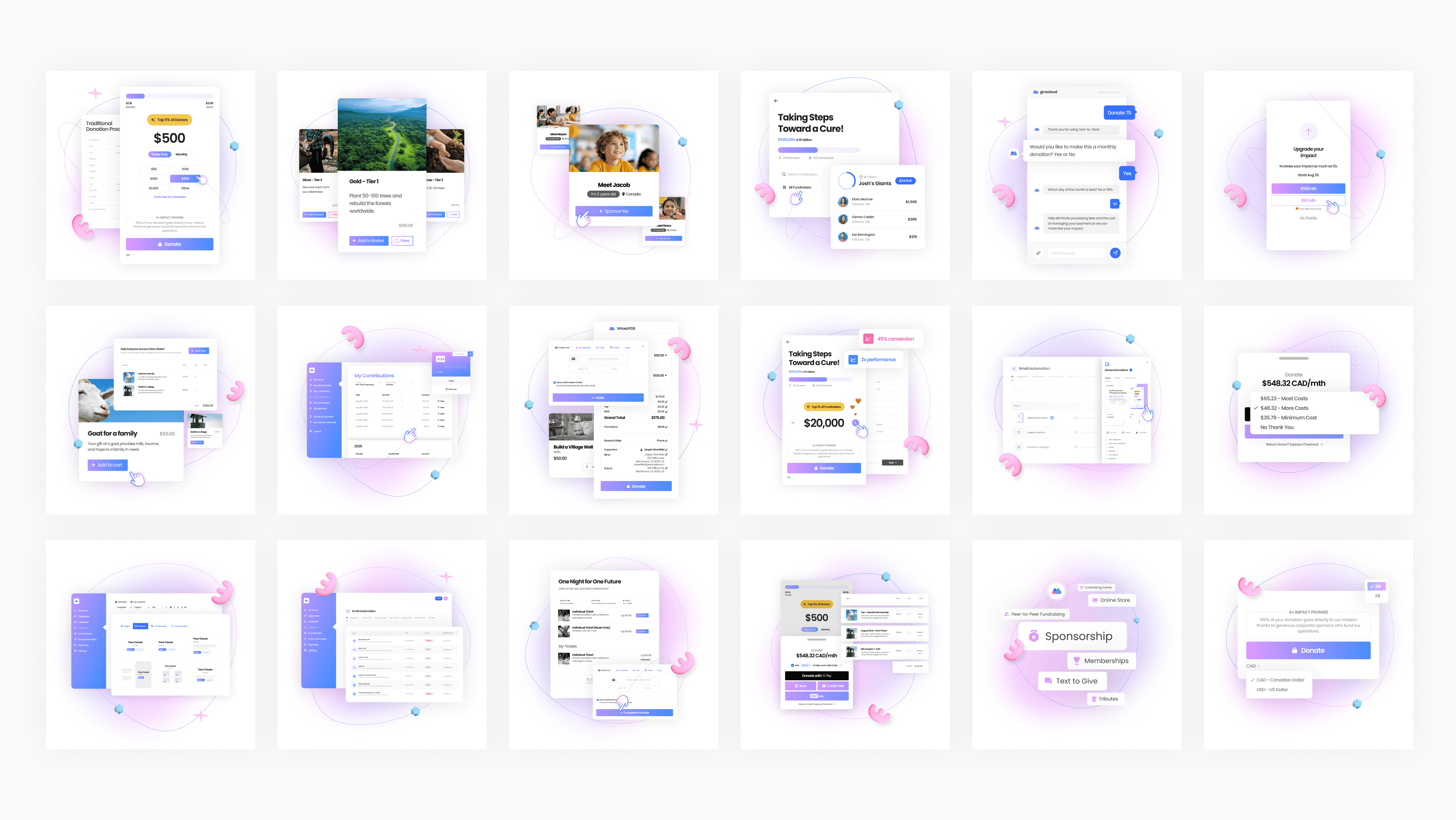
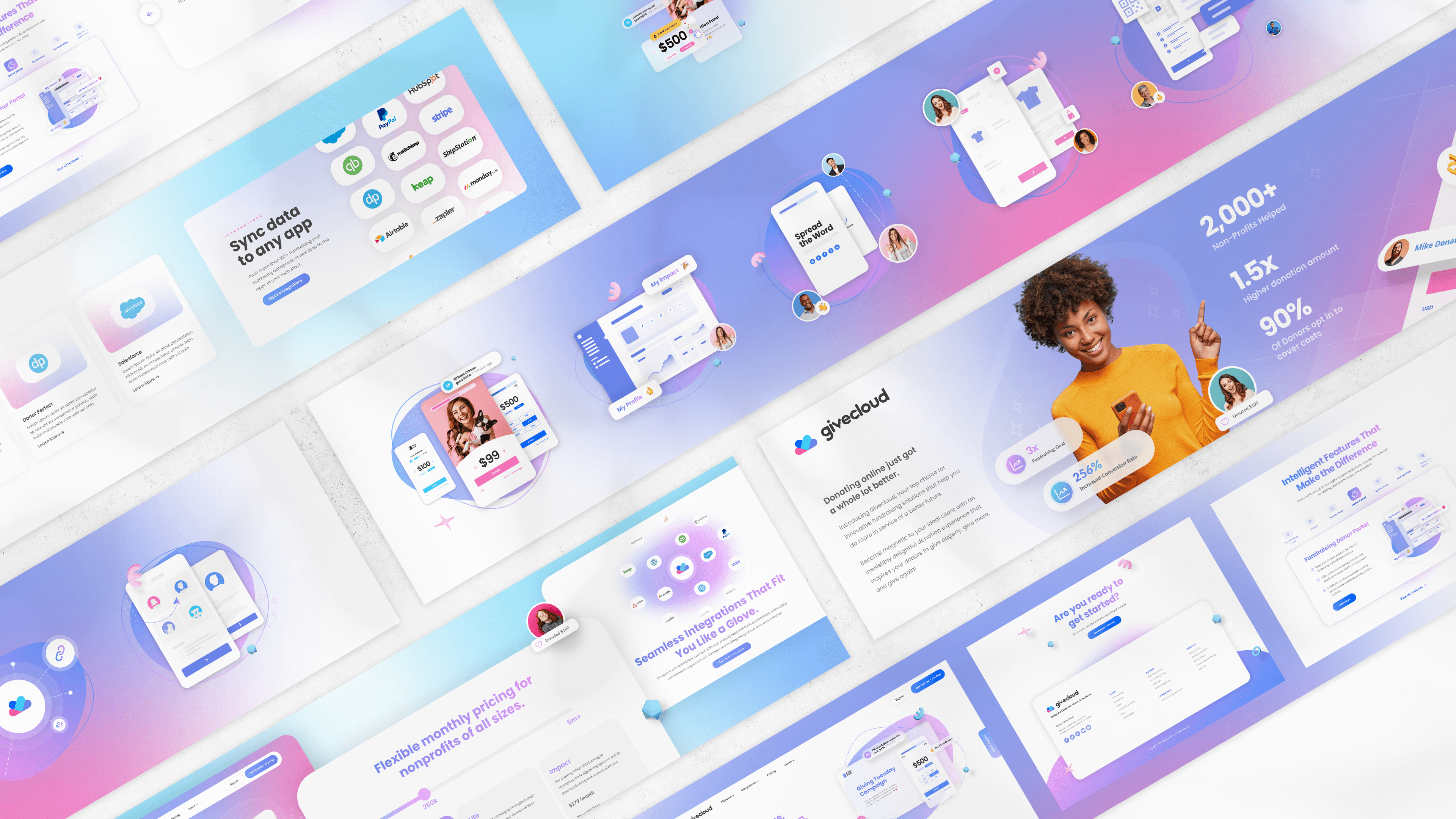
//
Impact & Results
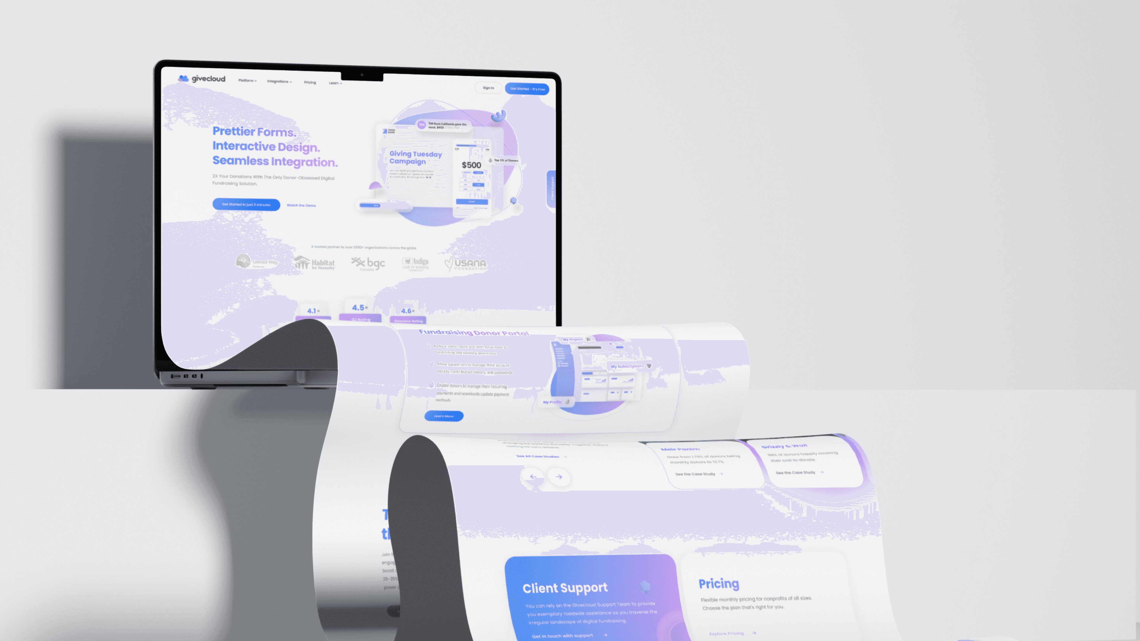
The animations helped Givecloud feel modern, trustworthy, and easier to understand — exactly what the rebrand aimed to achieve.
Outcomes included::
Higher click‑through rates
Better feature adoption
Improved comprehension in user testing
Fewer support questions
Reuse of designs across multiple campaigns
Additional work generated from the success of the project